Data & Code

Nicolas J. Duquette

ABOUT ME
CURRICULUM VITAE
RESEARCH
DATA & CODE

On this page, I post bits of code I intend to serve as public goods. If you are looking for code specific to individual projects, replication files are linked next to individual papers and projects on the research page.

Stata Plots

Each of the following is a code template for producing a plot using Stata's twoway command. Each example has been tuned to improve readability relative to Stata's graphics defaults.

I have included example data and verbose comments in each file. While many of the changes could be bundled into a scheme, I prefer to leave graphics options explicit in the template. This makes further changes specific to a particular plot simpler to make (and thus defaults less sticky).

I do not expect citations or attributions for these, but do appreciate hearing if you find these useful or have suggestions.

Publication Timeline Plot

I track major milestones of my research, and in 2018 I tweeted a visualization of my research progress. It turned out that other scholars wanted to plot their own work. The plot below is a cleaner, self-contained version of the original chart.

The colored markers represent milestones in a paper's progress to publication. The lengths of the lines visualize the total time to complete a project. Publications Plot

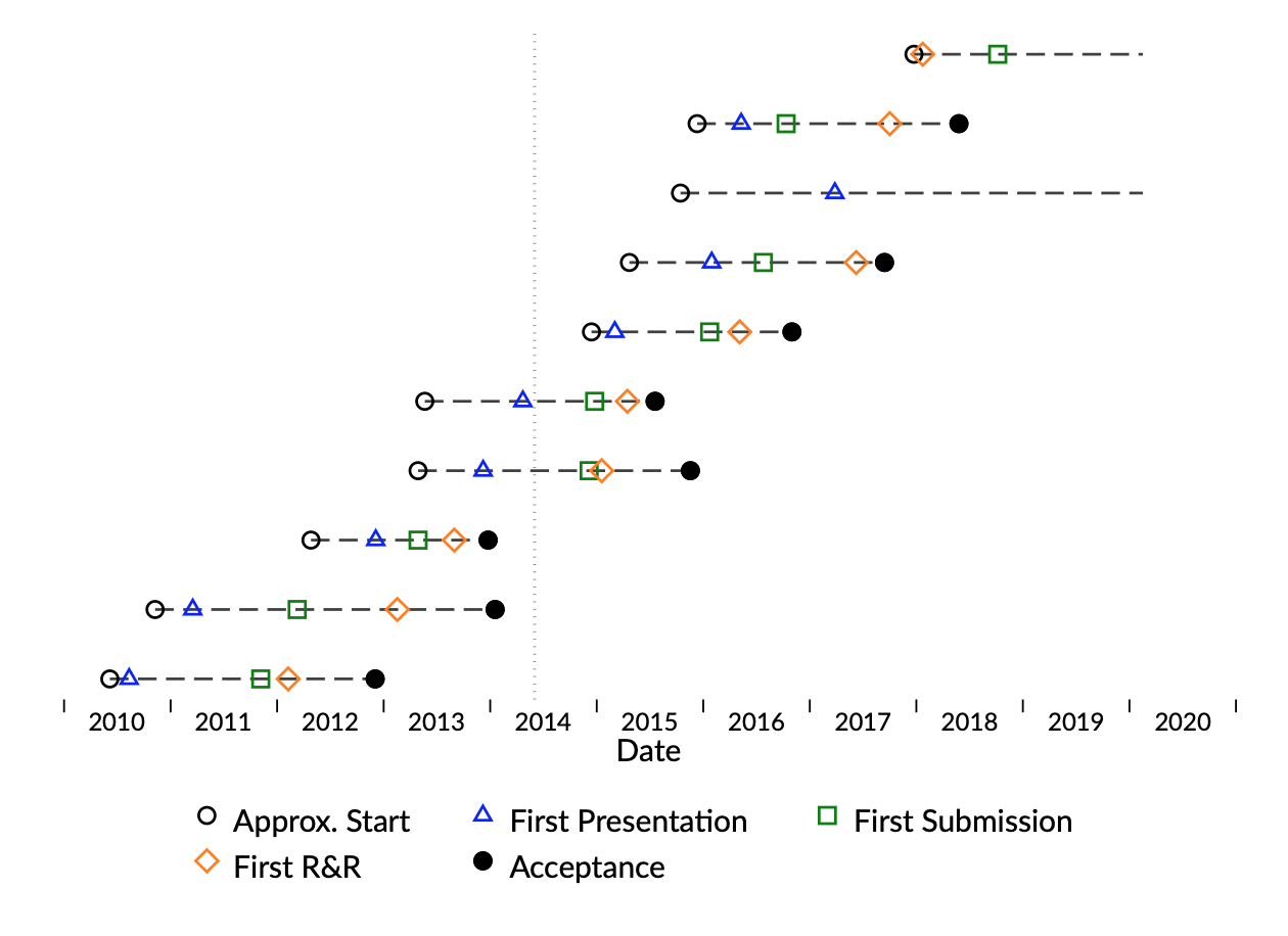
Download the Stata Do-file If you use R instead of Stata, Mark Scherz has created a version of this visualization in ggplot.

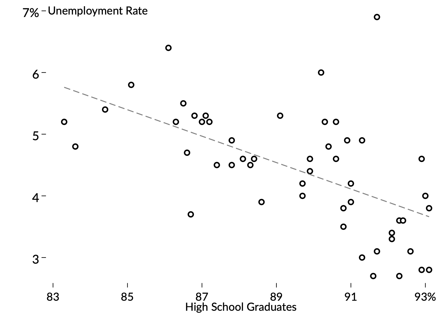
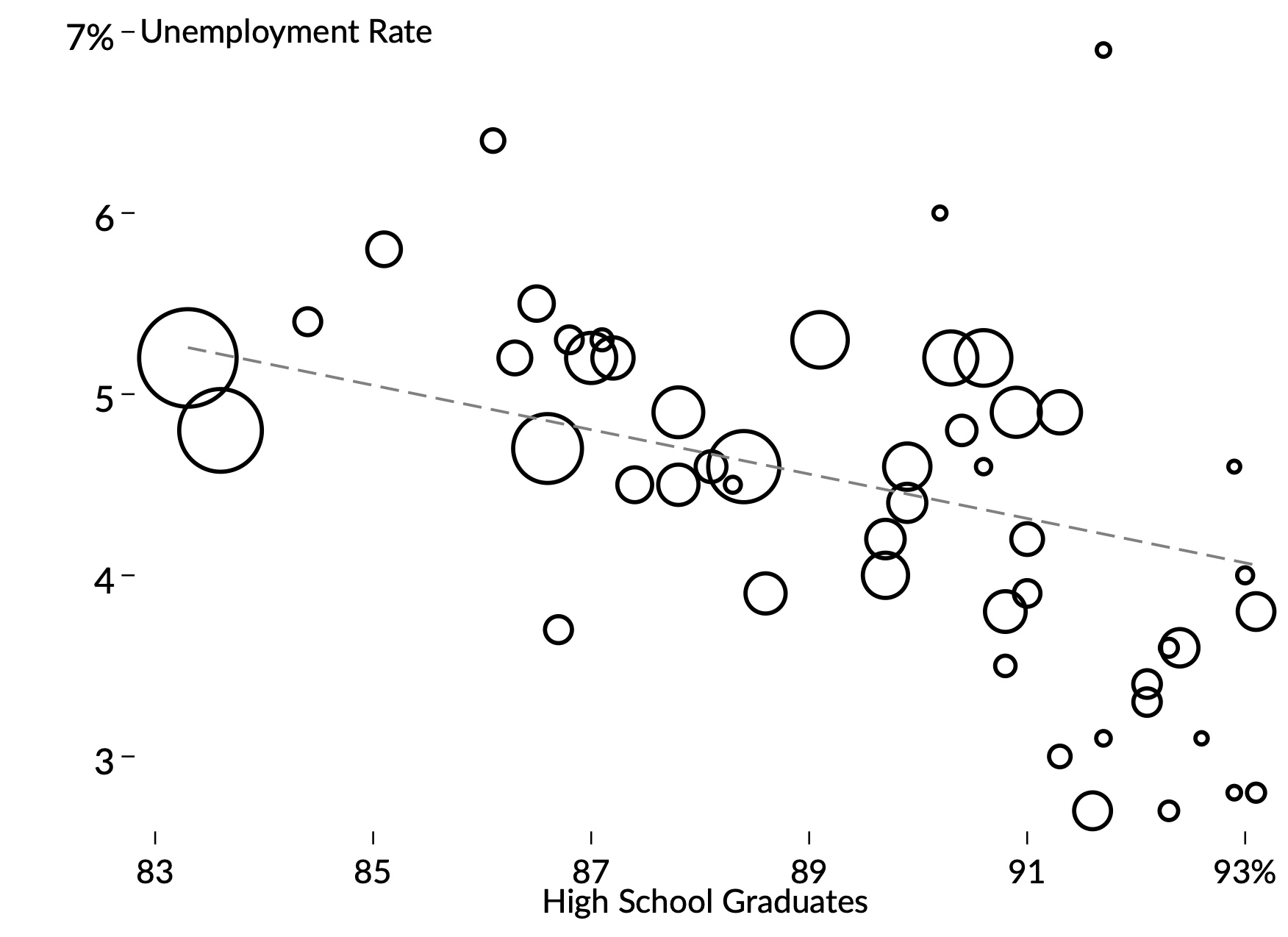
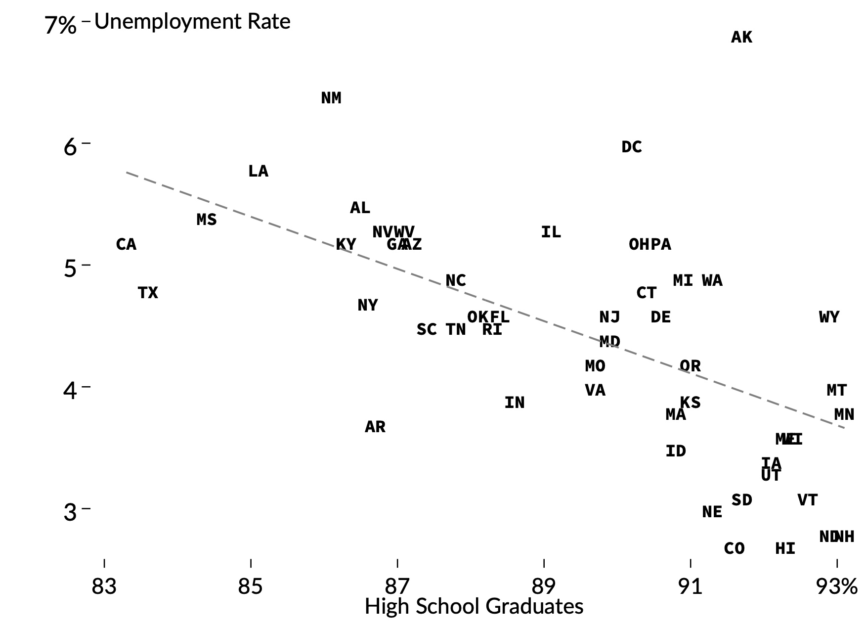
Basic Scatterplot Three Ways

These basic scatterplots tweak Stata's defaults to emphasize the data being visualized.
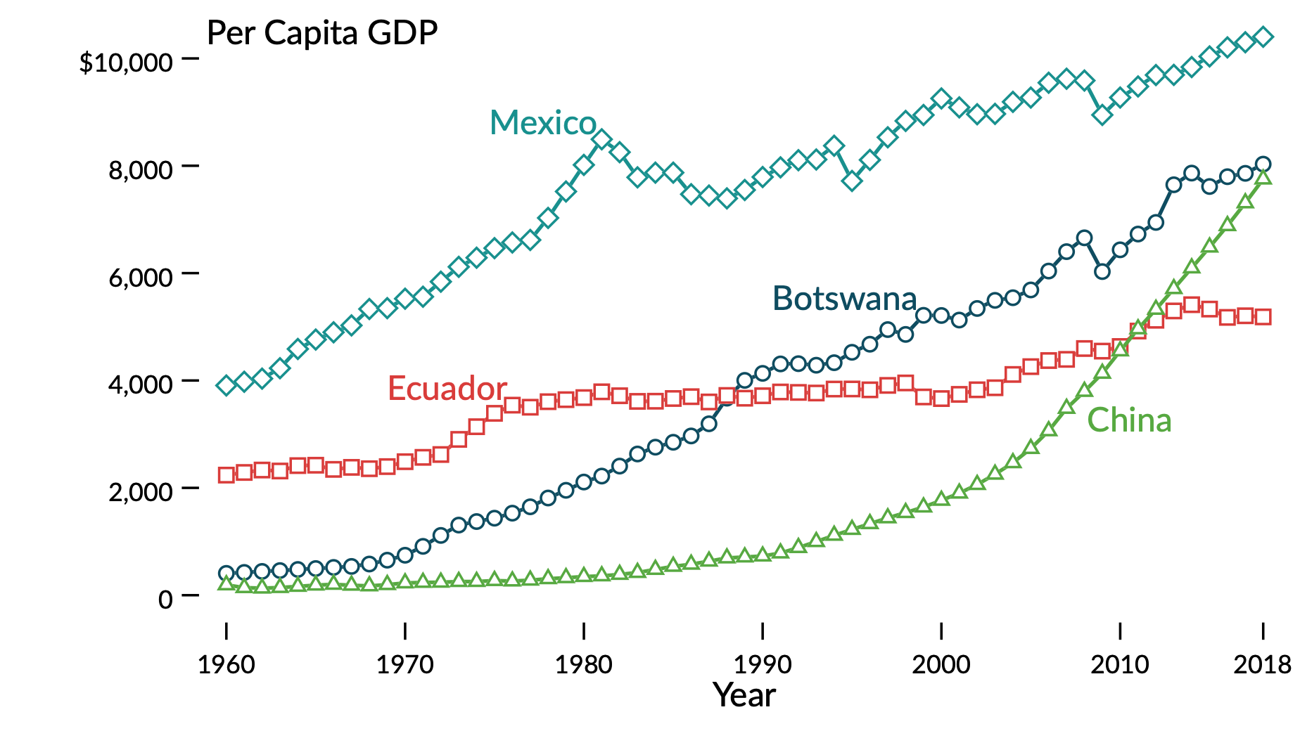
A basic scatterplot. Relative to Stata's defaults, this plot improves readability and emphasizes the data itself. Legends, borders, and gridlines are removed to reduce clutter. All text is horizontal (no neck-turning to read the vertical axis). Thick lines are reserved for the data points themselves. Scatterplot 1
This scatterplot is also very simple, but now the markers use Stata's weighting function to scale by state population. This gives the viewer a sense of the visible correlation for the average person, rather than the average state. The linear fit line is also for a population-weighted regression. Scatterplot 2
Here, the markers have been replaced with state postal abbreviations. The labels both mark points and inform the viewer which state each point represents. Scatterplot 3

Download the Stata Do-file

Time-Series Plot

The following chart plots series over time using a cleaner design as well as a palette of colors and set of shapes that are easily distinguishable under a variety of colorblindness conditions. Specifically, I used the color-testing tool Coolors.

GDP per capita for four countries over 58 years. The simplified design is meant to be attractive and legible even if the viewer is colorblind or the graph is printed to black and white. Time Series Plot

Download the Stata Do-file

This Web Site

This site is built on Tufte CSS, a set of web layout rules inspired by the books and ideas of Edward Tufte. The design of the research page is further influenced by the professional web page of Achyuta Adhvaryu.